
Fridays and Photos: photos off a camera vs. photos off an iPhone (and adjusting color)
Digital Cameras vs. iPhones
I am just going to preface… (like I always do!) about how much I love having a digital camera, and how it allows me to capture incredible memories and share them on my blog and social media channels. I will always be the one to convince you that purchasing a digital camera is worth the investment but I ALSO realize that smart phones make it easier to snap a good picture on the go. Your phone is ready to go right from your pocket, and how easy is it to instantly share a photo you just snapped on your phone? ..
…And the best part about camera phones - they are ALWAYS on you! I take photos on my phone A LOT. I have way too many photos and have purchased iCloud backup space that allows me to take thousands and thousands of pictures and videos (mostly of Jett of course!) I have been really making the effort to make sure I have my digital camera on me when we go out and do things - like go out to eat or go to the zoo ... but for all the times I’m hanging out at home, or walking Jett over to the park - my iPhone does the job just fine!
Editing (and applying presets to iPhone photos)
When it comes to the editing side of things… It must be said that as great and as convenient an iPhone camera is, there is still a significant difference in the quality of an image captured on a digital camera vs. off your phone's camera. Another thing that can be tricky with iPhone photos, are the way they respond to filters or presets. When I am applying my presets to my iPhone photos, sometimes I don’t know what I am going to get on the other side. While the photos taken off my camera seem to be more reliable when responding to filters, and colors end up more “realistic”, the same (unfortunately) cannot be said for iPhone photos. However there are simple ways to play around with the colors to get the look you want! This is especially helpful if you are wanting the feel of your Instagram feed to stay consistent over time!
I’ve put together a few examples of simple color adjustments you can make in Lightroom Mobile after applying a preset. (NOTE: I am using my MegCusick Presets here, but the concept can be used on any preset you apply! All adjustments I make are within Lightroom Mobile - a free download, just search for it in the App Store)
Color Adjustments
temperature, tint & vibrance
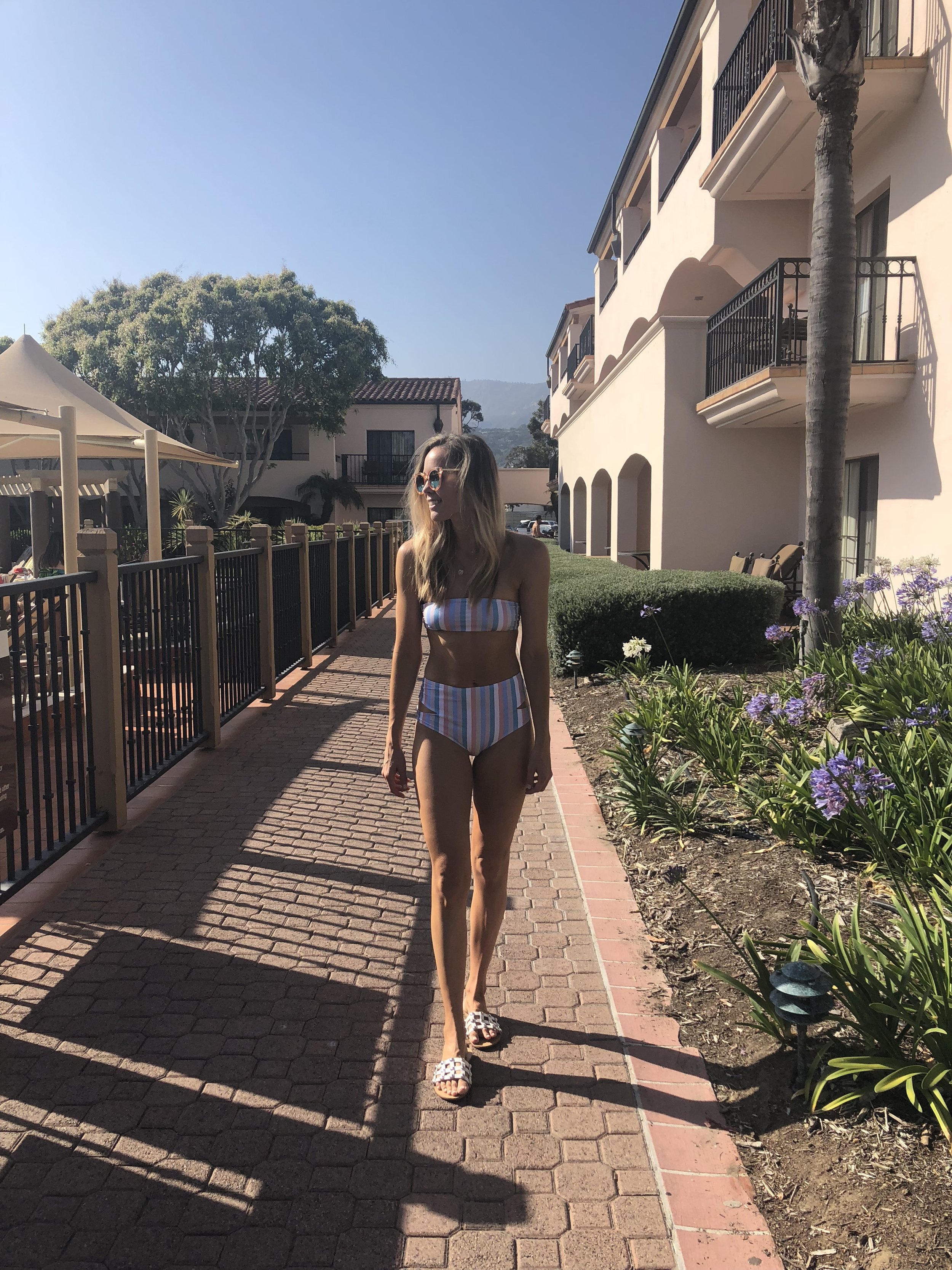
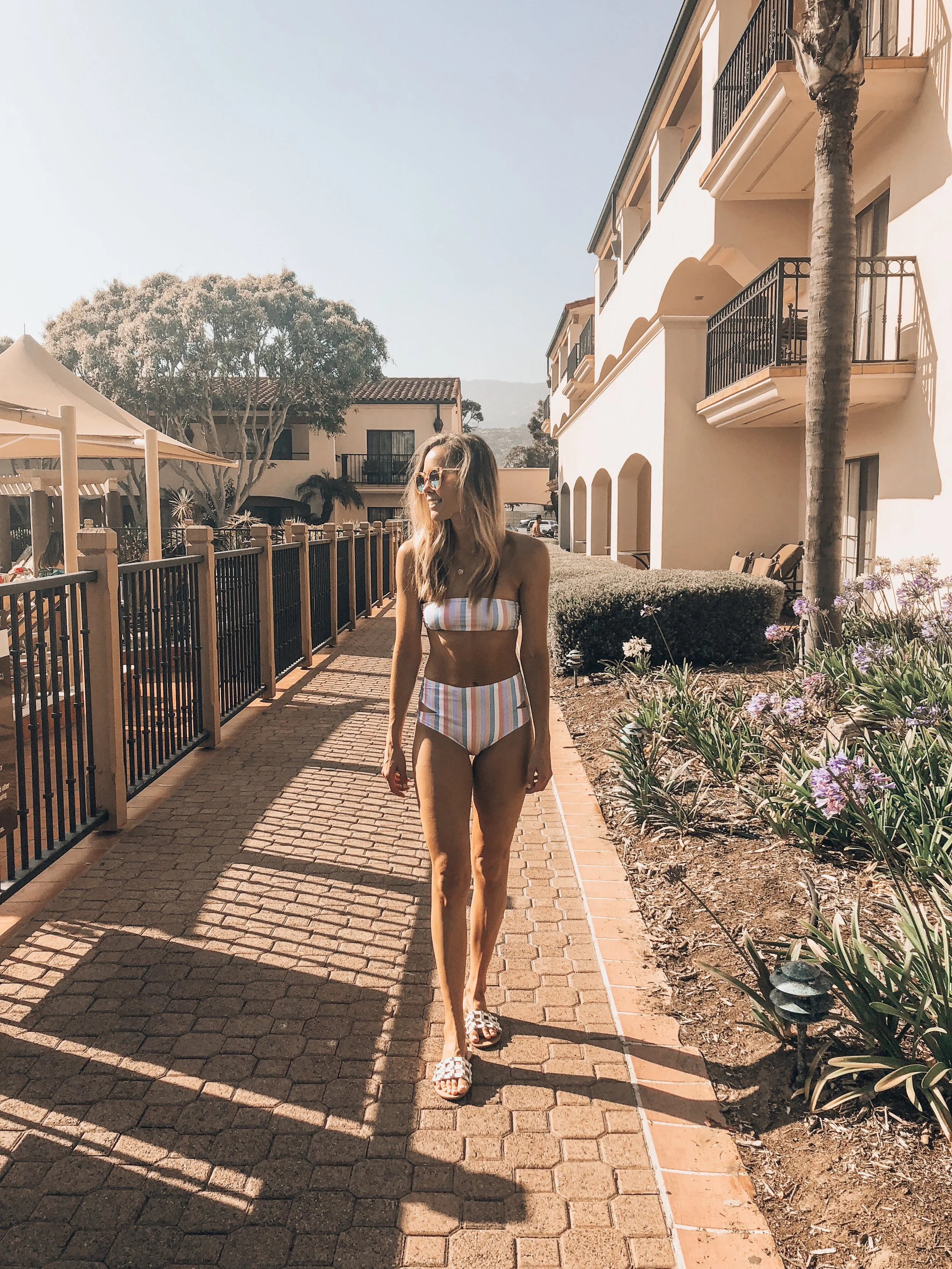
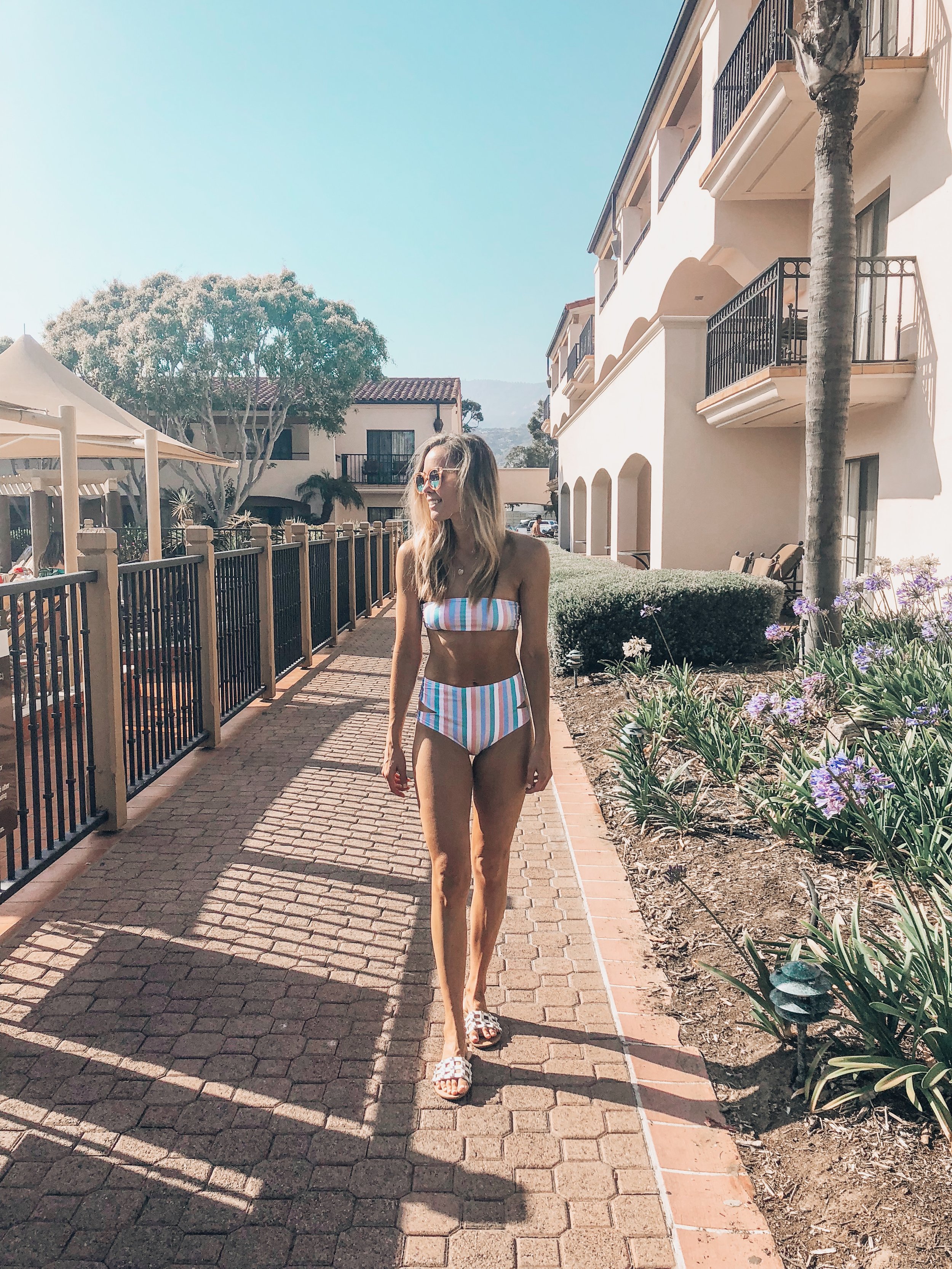
Far left: Photo taken straight off my iPhone. Middle: “June” filter applied. Right: After color adjustments were made so it fits better with the feel of my Instagram feed.
The photo above, once I applied my “June Preset” tends to bring out more golden/warm tones in iPhone photos. I still like the vibe that it creates, however some small color adjustments can be made to tone down the gold a little bit.
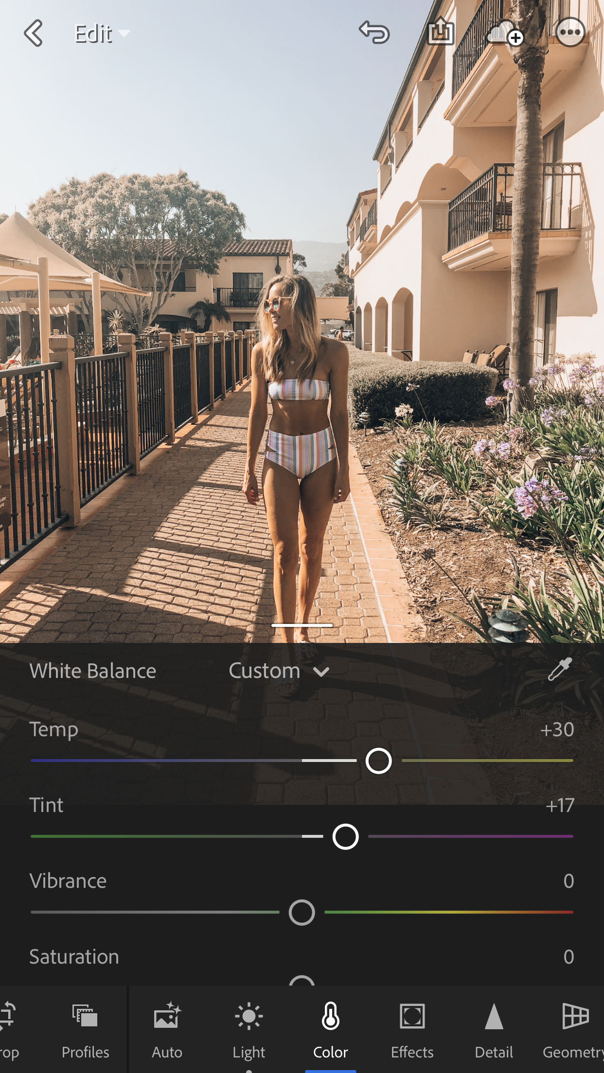
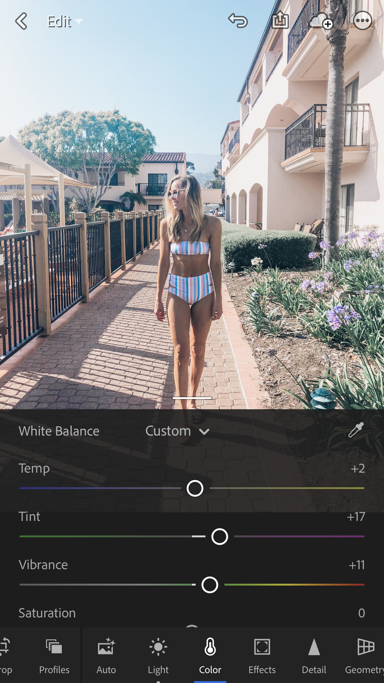
To play around with the overall colors of the photo - click the “color” tab shown above. On the left side you can see the settings of the Temp, Tint, and Vibrance as-is after the preset is applied. On the right you can see I pulled the temperature down to “+2” and bumped up the vibrance a bit to bring out the colors of my swimsuit, the flowers and the sky. There is no perfect strategy to adjusting colors. I just make small, incremental adjustments until the photo gets to looking the way I want it! You can definitely play around with Saturation as well on this tab, but for this photo I was happy with what I got from the changes in Temp and Vibrance.
Selective Color Adjustments
The number one thing I constantly run into while applying presets to iPhone photos is the drastic effect it can have on skin tone. Hands down this is the biggest issue I run into! Sometimes skin looks too orange and saturated…. and sometimes skin tone comes out looking dull and unnatural, it really depends on the lighting when the photo was taken, and the filter you apply! I have found it tricky to “hone” the process of finding the happy medium where skin color looks natural, but if you play around with it a little bit, you will learn what looks most natural for you and your photos. (NOTE: We are going to dive into adjustments for skin tone, but just remember that you can use the same process for ANY color you find needs to be adjusted in your photos)
Far Left: photo straight off my iPhone. Middle: photo with “May” preset applied. Right: Photo after selective color correction is made to calm down skin tone.
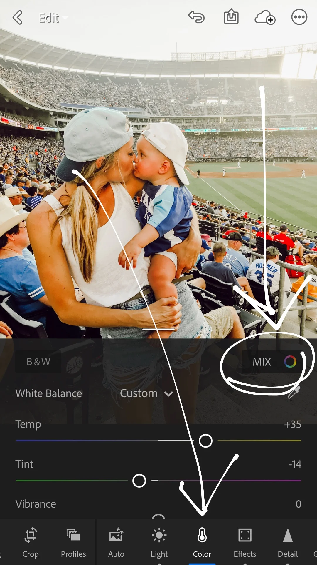
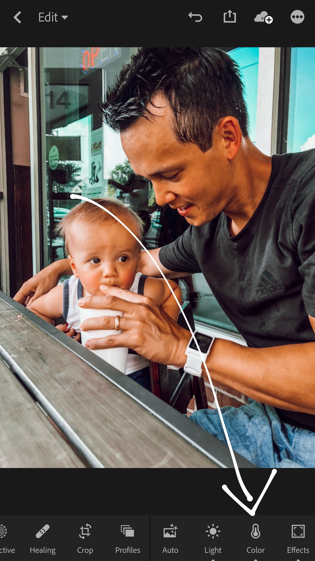
To get to selective color. First click the Color tab, then click on the upper right button “Mix”.
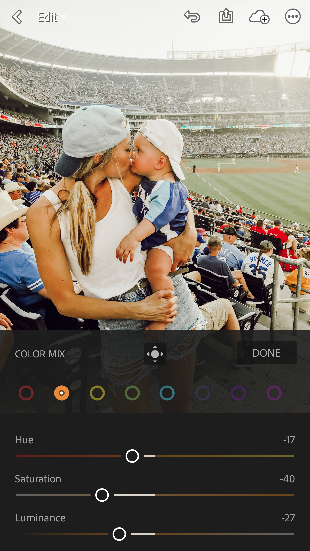
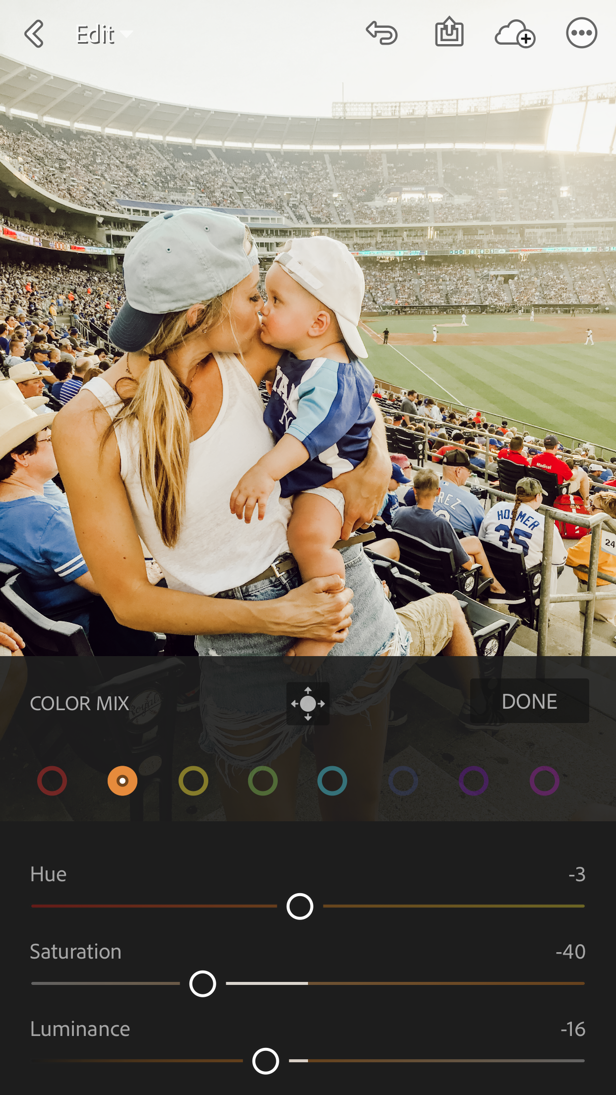
You can see after clicking on the Mix button, a menu pops up with 8 different colors lining the top and sliders titled “Hue” “Saturation” & “Luminance” (I will refer to this mix as HSL from here on out)
To calm down the skin tone - I typically go straight to the Orange color selection. Above on the left, you can see the settings of HSL once the preset is applied. From here, again, its a matter of playing around with the sliders to create the look you want. When you play with the HSL sliders in this selective color section, its ONLY going to adjust the color you have clicked on - so in this case, when we move the sliders after clicking on orange, its ONLY going to affect the orange tones of the photo - not the color of the entire photo (like we did in the first example above). On the right you can see where I landed in HSL to make the skin color more natural.
Here is an overview of WHAT Hue, Saturation, and Luminance mean, just in case you are wondering.
HUE: Is the actual color itself. By adjusting the Hue, you will see the “version” of orange change - from a reddish- orange, to a yellowish orange, and everywhere in between.
SATURATION: I’m sure most of you can figure out what Saturation means, but technically, its the amount of grey in the color. Saturation of of - 100 removes all color and you will see where that color was - it is now grey. Saturation of +100 gives you the most VIBRANCE possible of that particular color.
LUMINANCE: Luminance is simply the lightness, or brightness of that color. Luminance at -100 would be black and +100 would be white.
One Last Example of Selective Color Adjustments!
this one we will adjust the oranges & blues of the photo
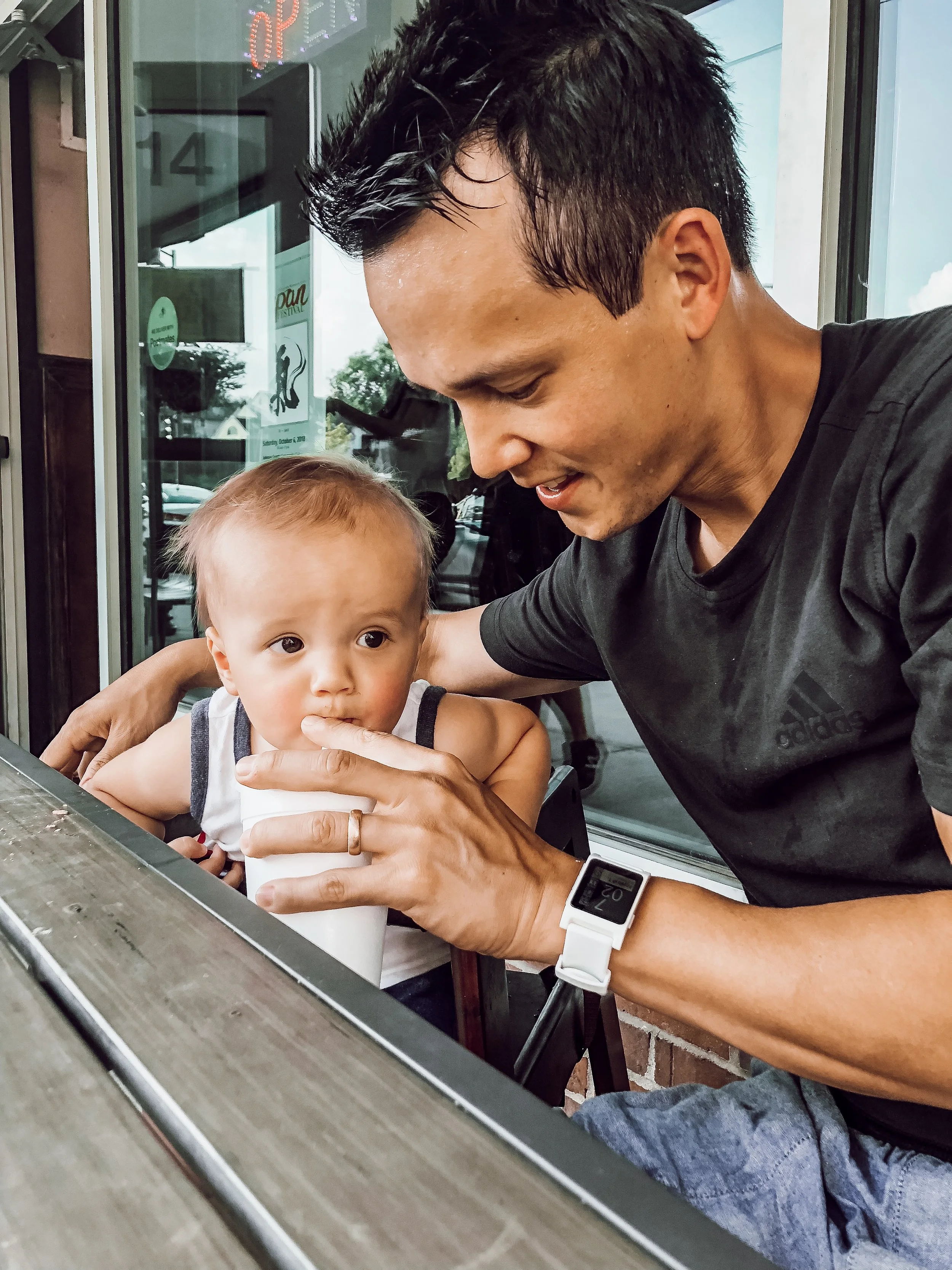
Far left: Photo straight off my iPhone. Middle: Photo after “July” preset applied. Right: Photo after adjustments to Orange and Blues through selective color.
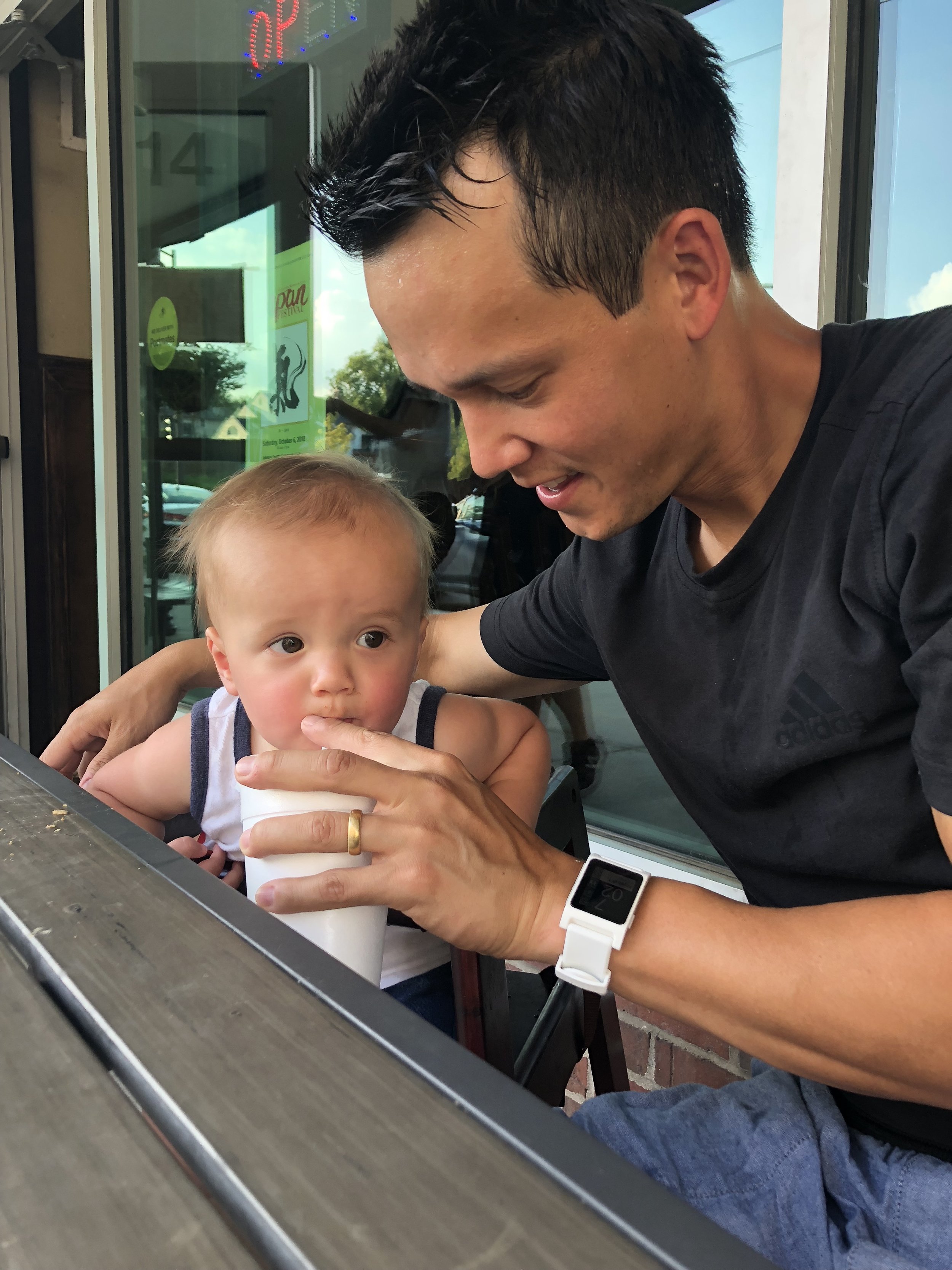
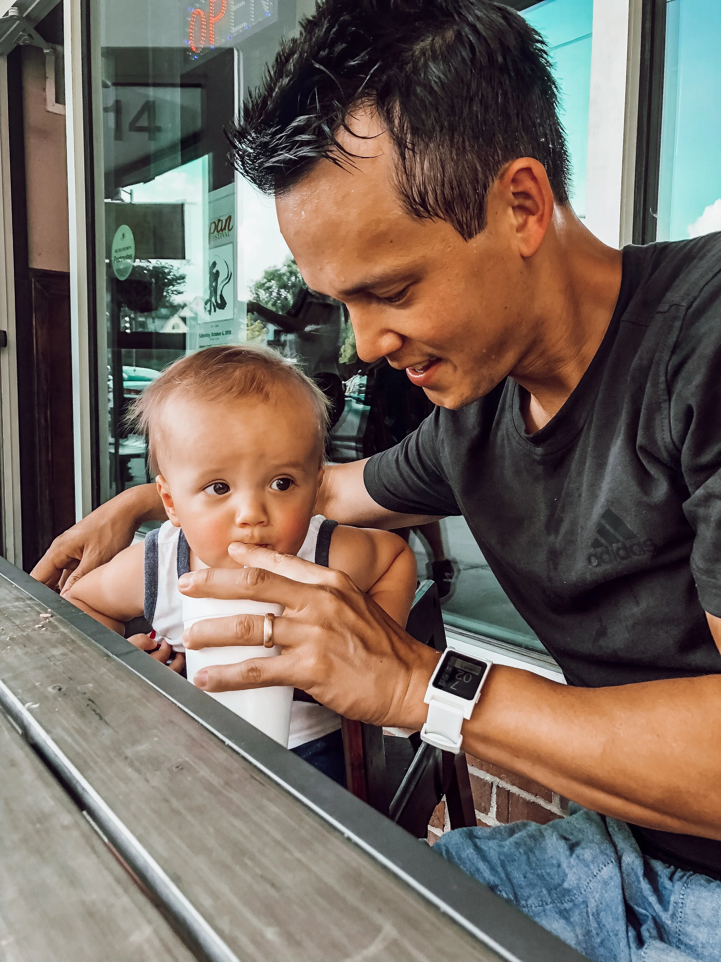
Here is the photo (REALLY CUTE PHOTO I might add! sorry Brandon, I know you are sweaty here - we had just finished a bike ride!) after my “July” preset was applied. July has a funny way of making skin more saturated looking in some photos, and too dull in others! I have found this to be the case on all photos I have taken on my phone - again you just never know how an iPhone photo will react to a preset!
So in this photo I wanted to make small adjustments - 1. to calm down the skin tone a bit, and 2. to bring down the brightness of the Blues that happened with the store window behind them.
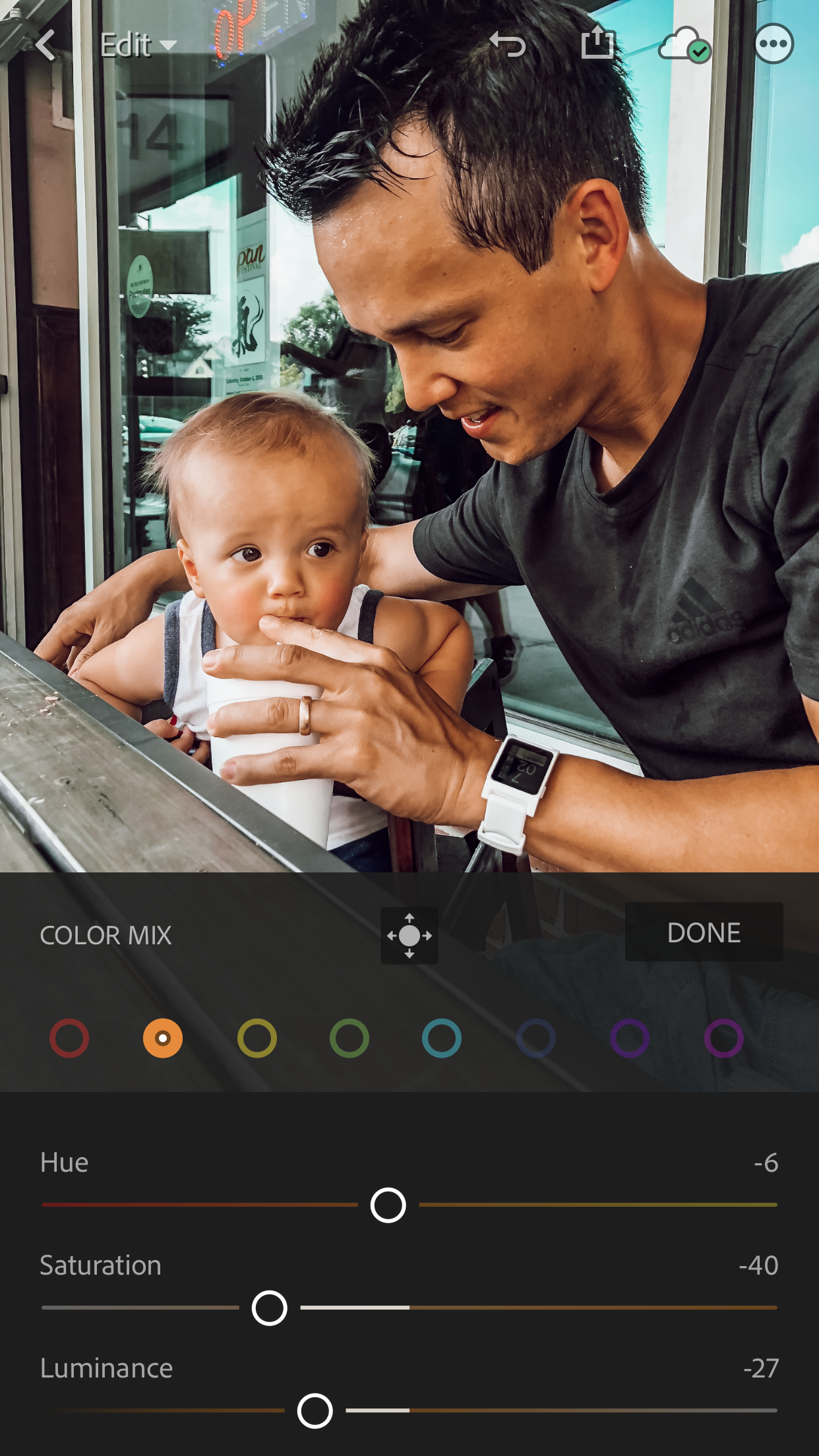
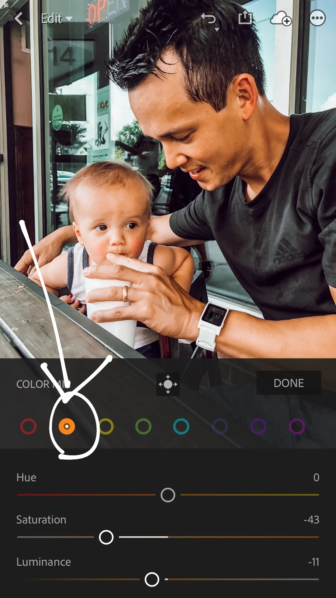
Above you can see what I did with my Oranges - slight change in Hue, decrease in Saturation, and increase in Luminance.
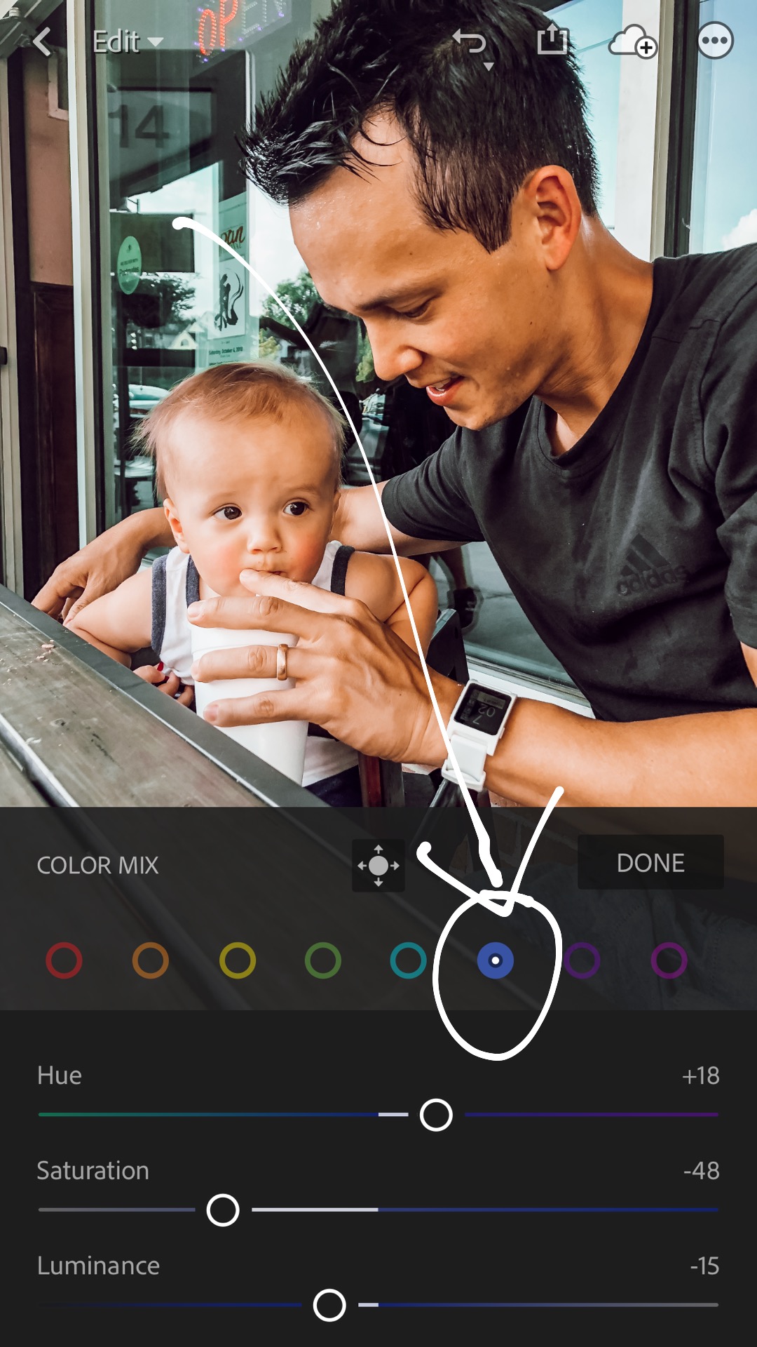
And now for the blues! Glass windows captured in iPhone photos always seem to come out very TURQUOISE, which I like to adjust a little bit. On the left you see what the blue HSL WAS at with the “July” Preset, and on the right, you can see where I landed after playing around with the sliders a little bit!

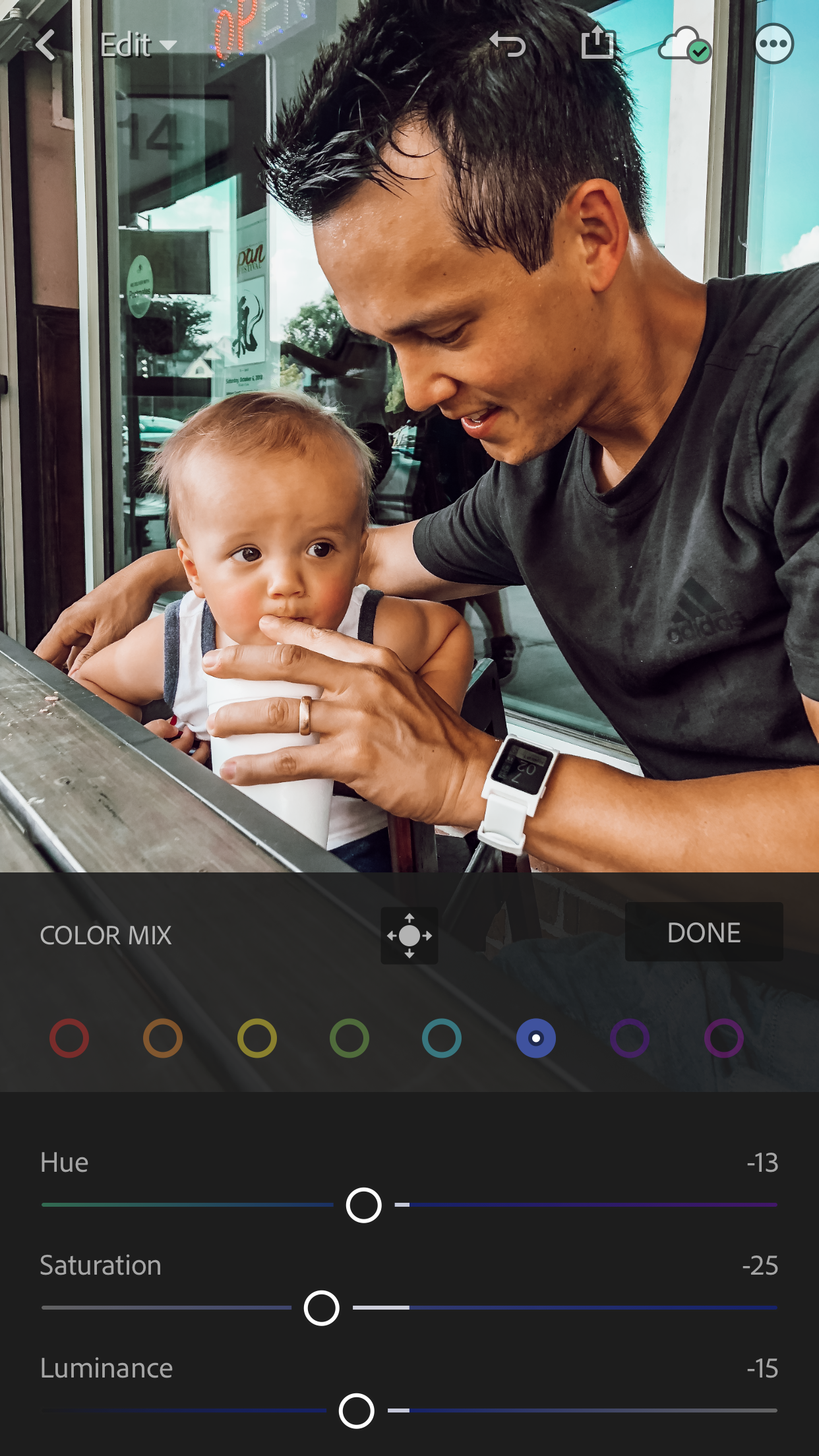
The final product!!
(cuties!)
There you have it! Now you can color correct like a pro!